When to Use Each Chart Type
Picking the wrong chart type is one of the most common mistakes when presenting data. A bar chart for monthly sales hides the trend a line chart would show immediately. The chart type is not a cosmetic choice — it changes what the audience actually understands.
Nice Graphs supports 5 chart types: bar, line, pie, doughnut and radar. Each one has a specific strength. This page explains what each type does well, when to avoid it, and how the AI in Nice Graphs decides which one to use by default.
Bar Chart — Best for Side-by-Side Comparisons
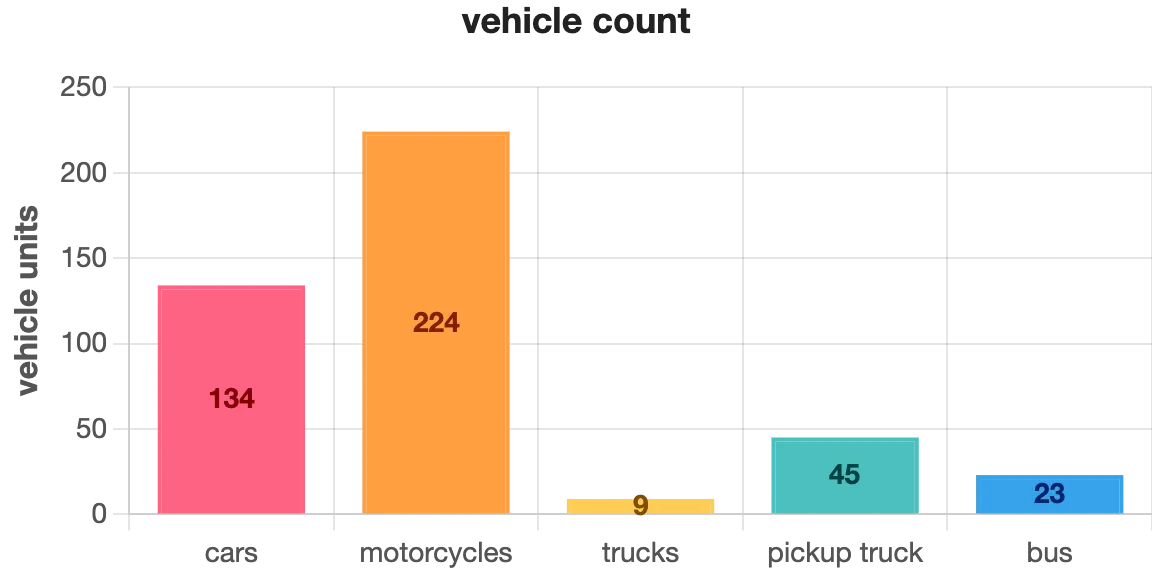
A bar chart is the most versatile chart type for comparing independent categories. Each bar represents one item, and the height (or length, in horizontal bars) shows its value. The differences between bars are immediately visible — no calculation needed.
Good examples: sales by product, votes by candidate, population by country, expenses by department. The data points don't need to be related to each other — they just need to be the same type of measurement.
Avoid bar charts when the categories have a natural sequence (like months or years) — in that case, a line chart communicates the trend more clearly.
In Nice Graphs, the bar chart is the default. When the AI reads your text and can't detect a clear time sequence or proportional relationship, it generates a bar chart — because it works for almost any type of numerical comparison.
Line Chart — Best for Trends Over Time
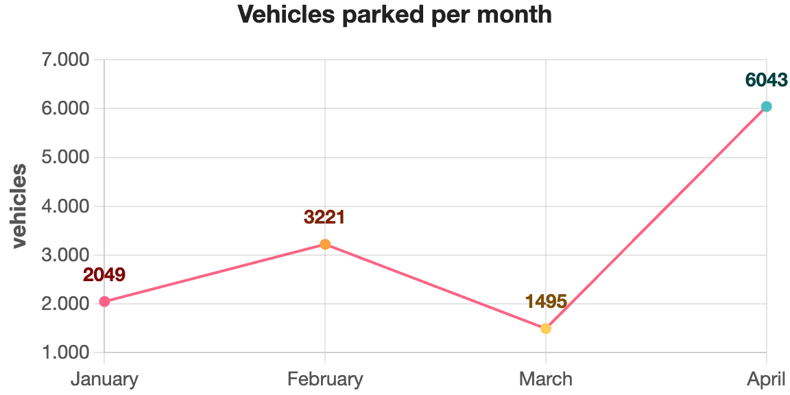
A line chart connects data points in sequence, which makes it perfect for showing how something changes over time. The slope between two points tells the story: rising means growth, falling means decline, flat means stability. That narrative is much harder to read in a bar chart.
Use it for: monthly revenue, daily website visits, quarterly growth rates, temperature over the year, number of users over time. The horizontal axis should always represent a time sequence — days, weeks, months, quarters, or years.
Avoid line charts when the data points are not part of a sequence. Connecting "Brazil, France, Japan" with a line implies a progression that doesn't exist, which misleads the reader.
When you paste text into Nice Graphs and the AI detects time-related labels (months, years, or words like "Q1", "January", "2023"), it automatically switches to a line chart to preserve that temporal meaning.
Pie Chart — Best for Showing Proportions of a Whole
A pie chart divides a circle into slices, where each slice represents one category's share of the total. It answers the question "what percentage does this represent?" at a glance.
Good examples: market share between competitors, budget split by department, survey responses (agree / neutral / disagree), device types (mobile / desktop / tablet). The key rule: the slices must add up to 100%.
Avoid pie charts for data that doesn't represent parts of a whole. When slices are close in size, a bar chart makes the differences easier to spot.
Doughnut Chart — Pie with a Hollow Center
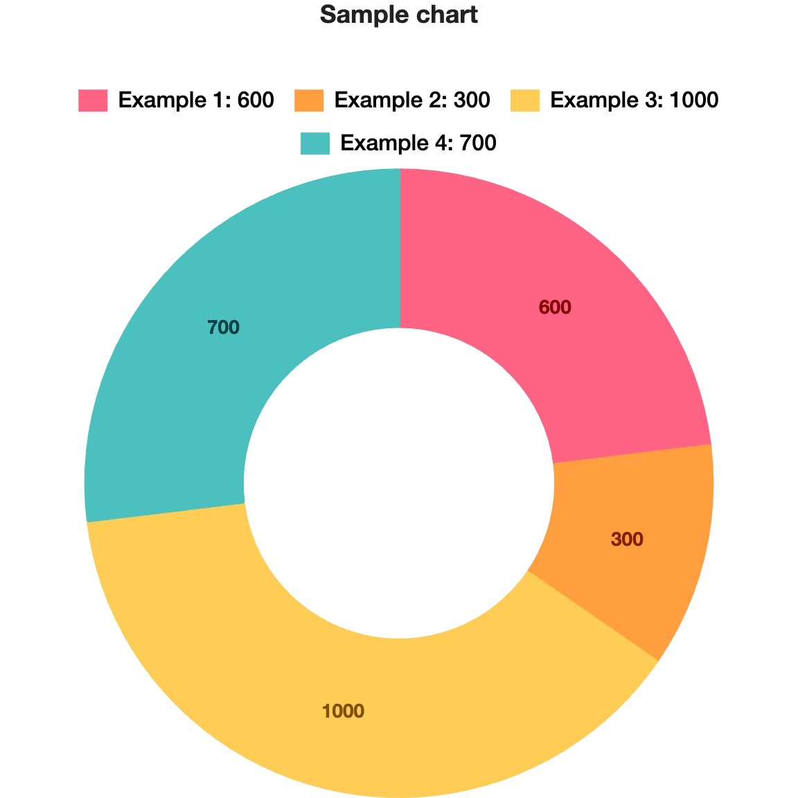
A doughnut chart is structurally identical to a pie chart — same data, same purpose, same rules. The only difference is the empty center, which makes it look cleaner in modern designs and leaves space to display a key number (like the total or the largest category's value) inside the ring.
Use a doughnut chart in the same situations you would use a pie chart. If you're building a presentation or a report where visual style matters, the doughnut tends to feel less cluttered.
Radar Chart — Best for Multi-Variable Comparisons

A radar chart (also called a spider chart) plots multiple variables as axes radiating from a center point, forming a polygon. The shape of the polygon shows how an item performs across all variables at once.
It's most useful when you're comparing a single subject across several criteria, or comparing two subjects on the same criteria. Classic examples: a student's performance across different subjects, a product evaluated on price, quality, durability, design and support, or two athletes compared across speed, strength, agility, endurance and technique.
It's a less common chart type, but very effective when the goal is to show a performance profile rather than a single ranking or trend.
Which Chart Should You Use? Quick Reference
Not sure which type fits your data? Use this as a quick reference:
- Bar chart — comparing independent categories (products, countries, candidates, departments)
- Line chart — values that change over a time sequence (months, years, quarters)
- Pie chart — parts of a whole that add up to 100%
- Doughnut chart — same as pie, with a cleaner visual style
- Radar chart — one or two subjects compared across multiple criteria simultaneously
You Can Always Change the Chart Type
Nice Graphs picks a chart type automatically based on what the AI reads in your text. But you're never locked into that choice. After generating a chart, you can switch to any of the 5 types with one click — directly in the editor.
Change the type, adjust colors or labels if needed, and download. See input and output examples, or the how-to-use guide.
Paste any text with numbers and see which chart type Nice Graphs generates for your data.
Try it free