Understanding Data Visualization: From Numbers to Insights
Every day, we're surrounded by data. Sales figures, website traffic, student grades, health metrics—raw numbers are everywhere. But spotting the real story in those numbers? That's where visualization comes in. A well-designed chart can reveal patterns in seconds that would take minutes to extract from a spreadsheet.
What makes a good visualization
At its core, a visualization is just a different way to tell a story with data. Instead of listing numbers, you're showing relationships, patterns, and trends visually. A bar chart emphasizes comparisons. A line chart highlights changes over time. A pie chart shows proportions. Each format has its purpose.
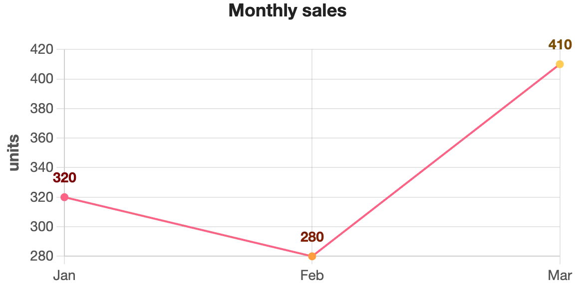
Think about monthly sales data. Whether you're checking if revenue improved this quarter, identifying your best-selling month, or spotting seasonal patterns—a line chart makes it obvious at a glance. That same data in a spreadsheet? You'd be scrolling and calculating.
Why people actually use charts
We're visual creatures. Our brains process images 60,000 times faster than text. That's not just marketing speak—it's how our brains are wired. When you see a trend line going up, you instantly understand "growth." When you see bars at different heights, you immediately grasp "differences." No interpretation needed.
Beyond speed, there's credibility. A report with charts looks authoritative. Whether you're presenting to clients, shareholders, or your team, a clean visualization builds confidence in your findings. It says "I understand this data well enough to explain it clearly."
Real advantages you'll notice
First, clarity. Complex datasets become digestible. Second, communication. Everyone interprets a chart the same way—there's no ambiguity like there might be with written explanations. Third, decision-making becomes faster. When the data is clear, decisions follow naturally.
Then there's the practical side: charts compress information. A 10-row spreadsheet and a 100-row dataset might tell the same story through the same chart. That efficiency matters when you're dealing with real-world amounts of data.
Where this actually matters
Any field dealing with data relies on visualization. Marketing teams track campaign performance. Finance teams monitor budgets and forecasts. HR tracks hiring and retention metrics. Healthcare professionals analyze patient data. Research teams present findings. E-commerce stores watch sales trends.
Even in everyday contexts—checking how many steps you walked, comparing prices before a purchase, reviewing your utility bills—people unconsciously prefer a visual summary over raw numbers.
Creating charts shouldn't be complicated
For years, making a chart meant wrestling with spreadsheet software or specialized tools. You'd manually enter data, adjust settings, deal with formatting issues. It was tedious, especially for quick analysis or when data comes from various sources.
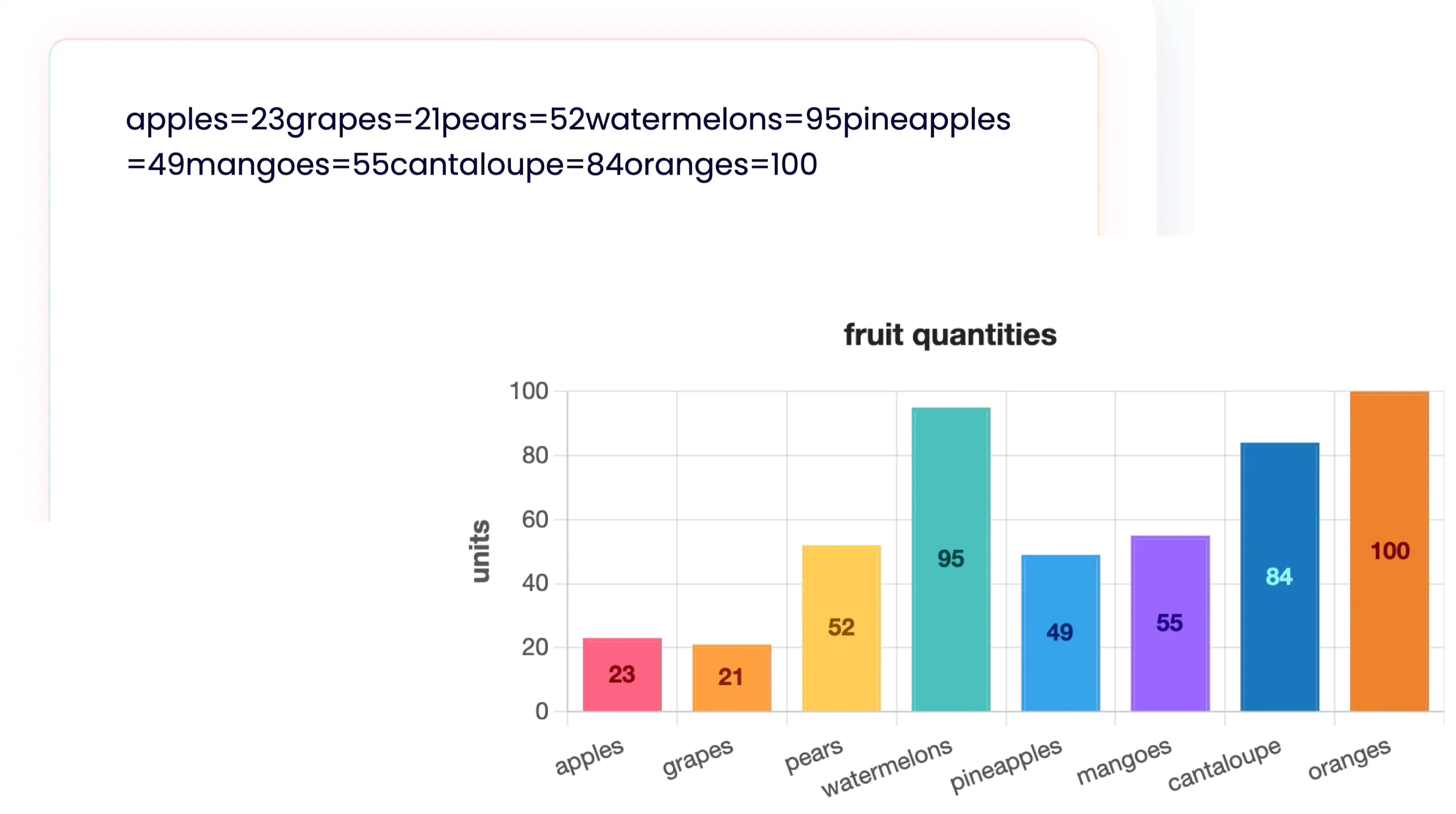
That's where automation comes in. Tools like Nice Graphs take a different approach: paste your text with numbers, and get a chart instantly. No formatting, no manual organization. The AI reads your content and creates the visualization for you.
Turn any data into a chart in seconds
Paste text with numbers or statistics directly into Nice Graphs. Sales data? Import it. Survey results? Works. Random numbers in a chat message? It'll parse it. No formatting required.
The platform generates a chart automatically. Then you choose how to display it—bar chart, line graph, pie chart, donut, or radar. Export as PNG for sharing or PDF for reports.
Try generating a chart from text right now. Paste any data and see what happens.
Generate your chart