Examples of generated charts with Nice Graphs
See below some examples of how texts containing numbers can be automatically transformed into charts. Just enter a text with data and the platform will interpret the information to produce clear, well-organized charts.
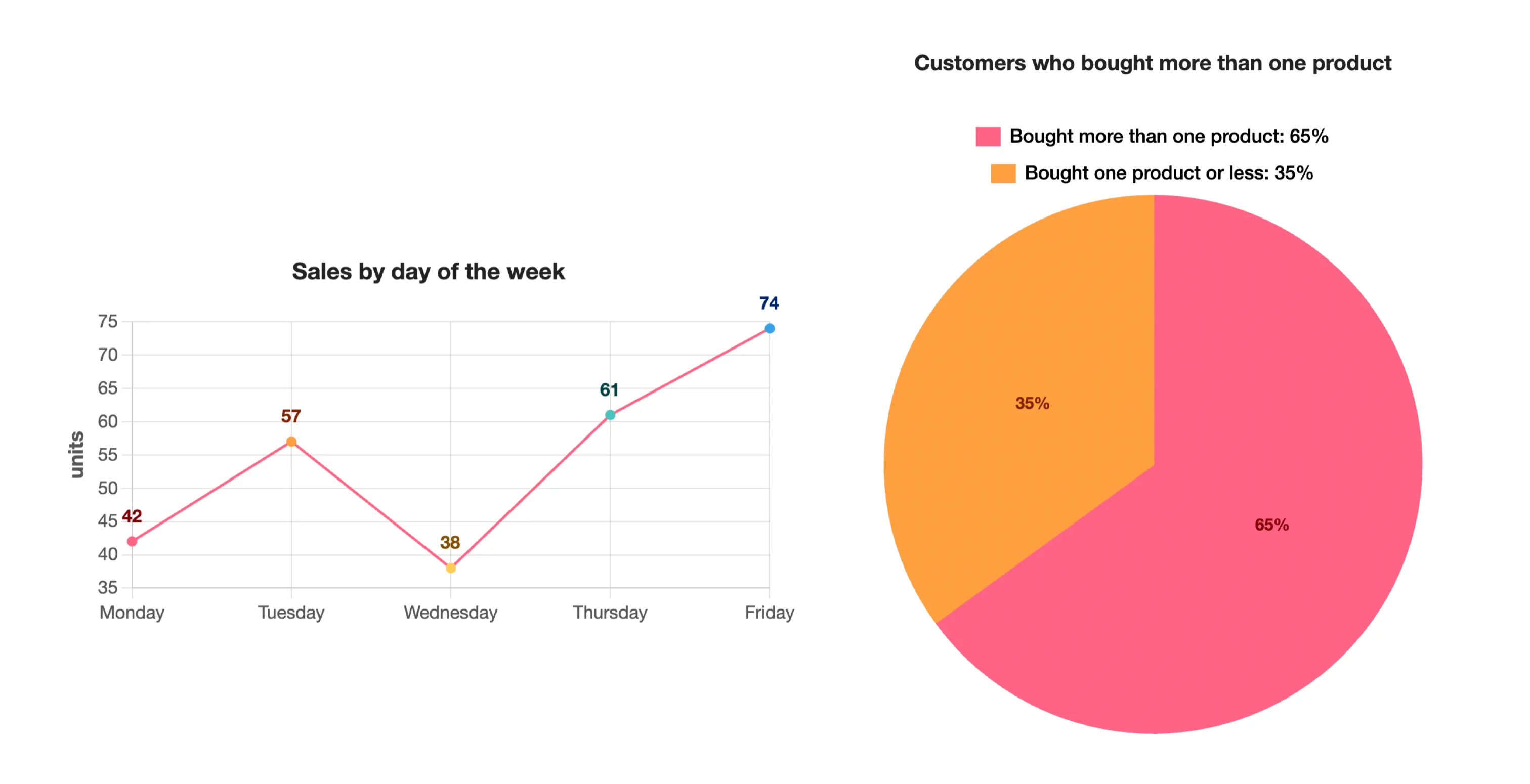
Example 1 – Monthly sales text
Input text:
Automatically generated chart:
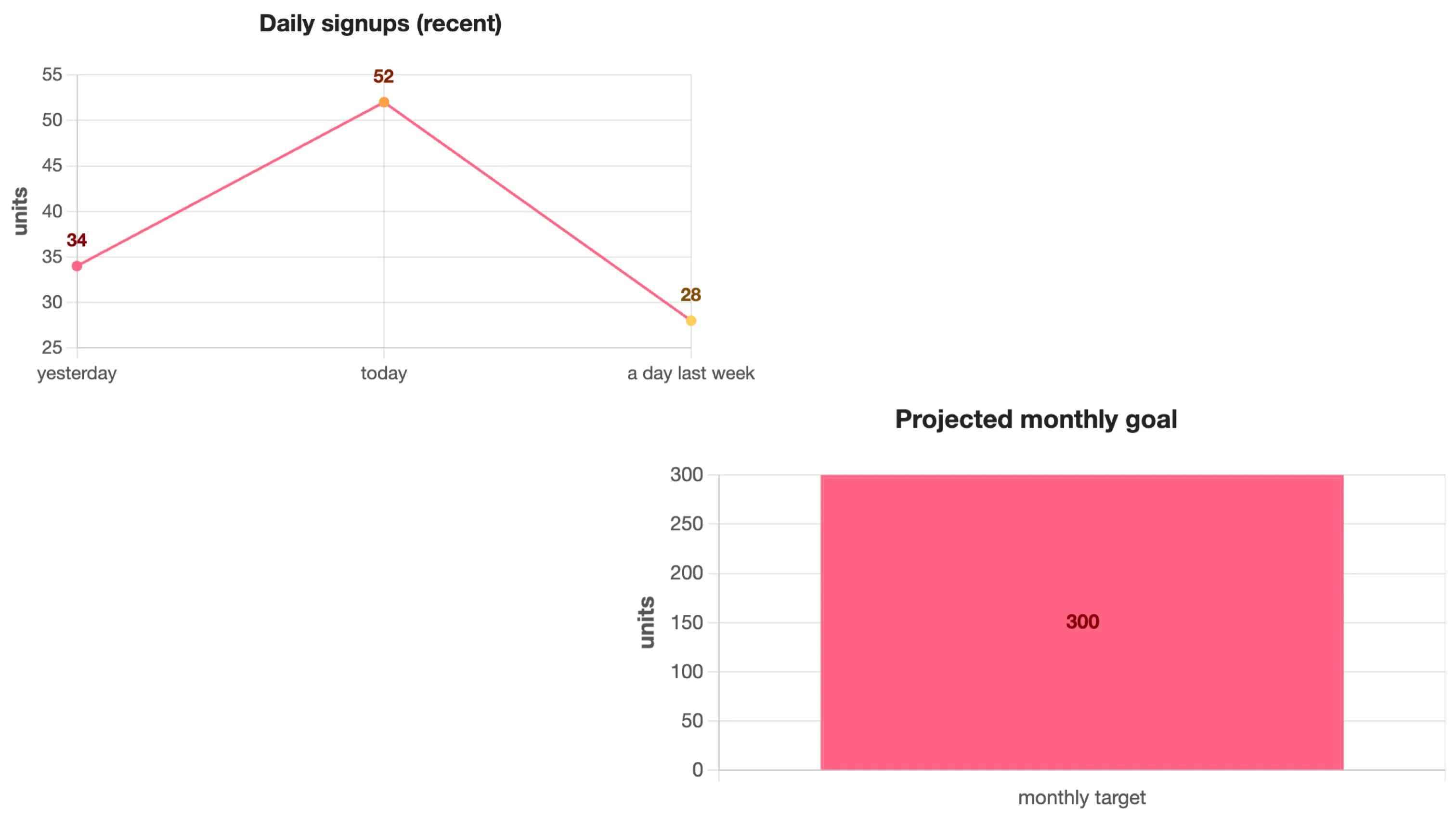
Example 2 – Chat-style text
Input text:
Automatically generated chart:
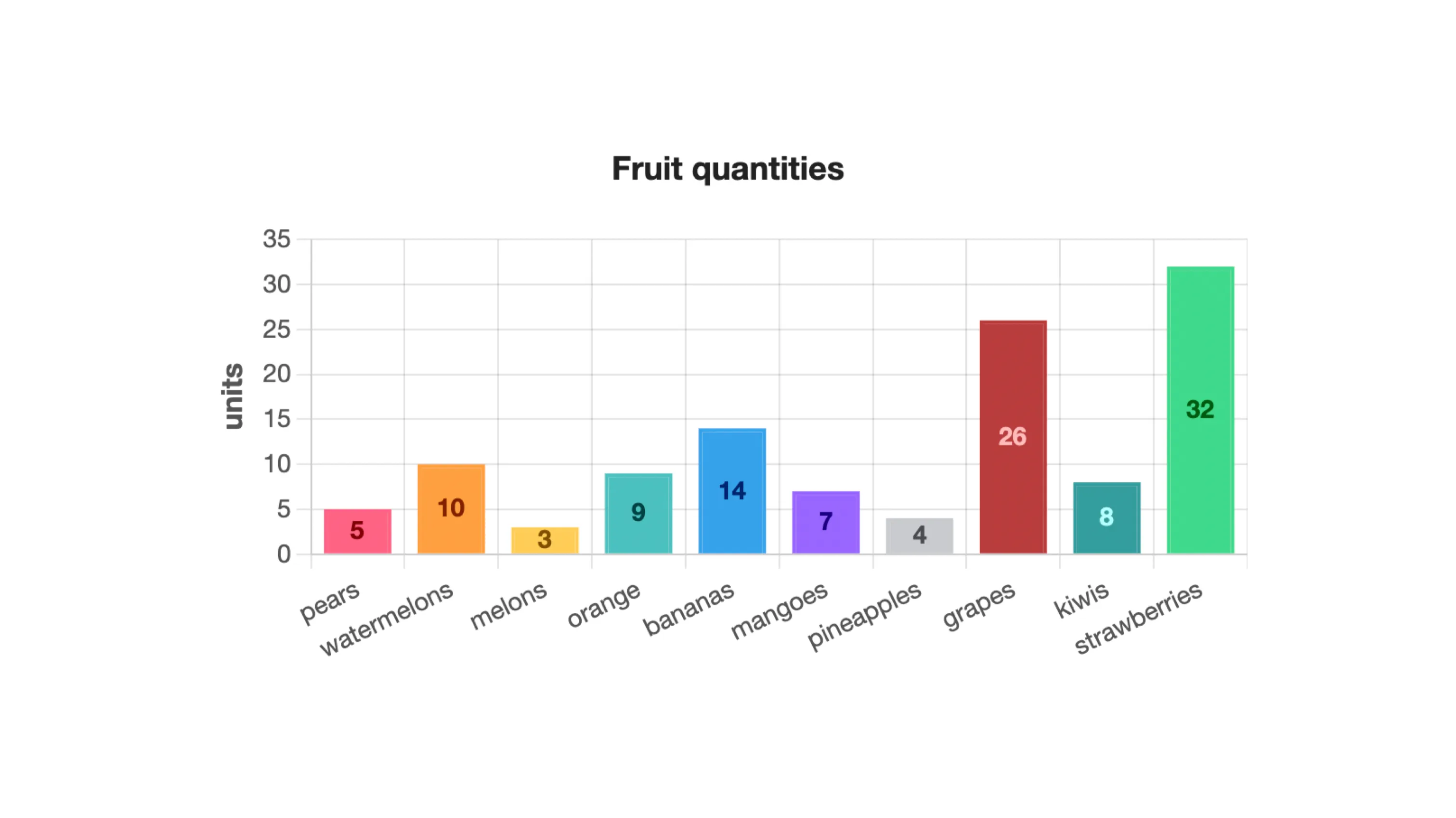
Example 3 – Fruits bought at the market
Input text:
Automatically generated chart:
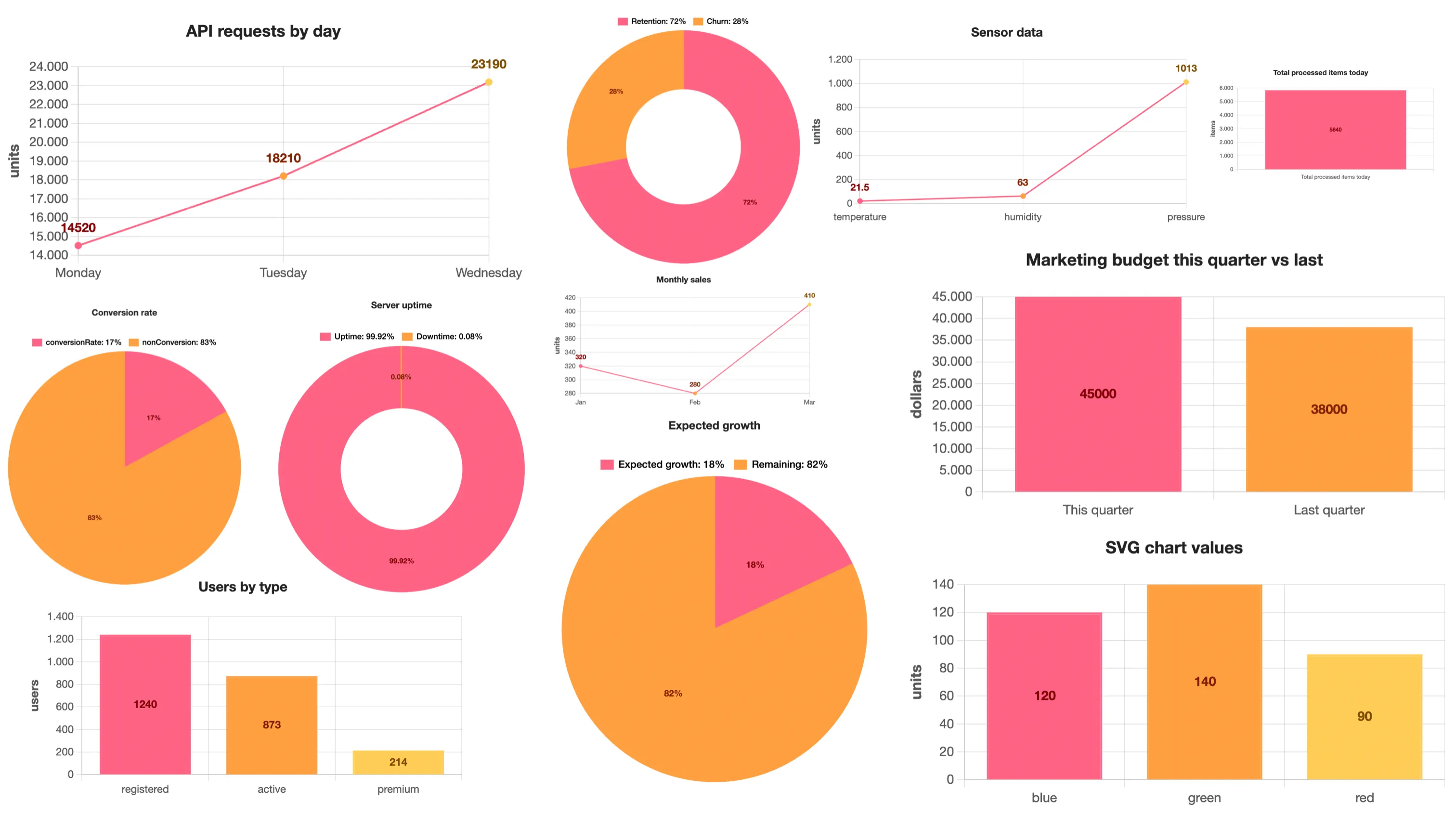
Example 4 – Random and messy data
Input text:
Automatically generated charts:
Create your own charts
These are just a few simple examples. You can paste almost any text containing numbers or statistics and the system will try to automatically interpret the data to generate a suitable chart.
Try the tool now and see your data transformed into charts automatically.
Try the tool