Chart Colors: How to Choose Palettes That Actually Communicate
Picking chart colors is not about making things look pretty it is about clarity. A chart with five data series in five shades of blue confuses readers before they even read the title. This guide covers what actually goes wrong with color selection and how to fix it with practical rules you can apply right now.
Why Color is a Functional Element, Not a Decorative One
Eyes process shape and color before any text. When two adjacent bars share similar hues, the brain groups them as the same category, even when the legend says otherwise. This creates visual friction that slows comprehension and can lead to misreading the data entirely.
In presentation environments, the problem gets worse: projectors and poorly calibrated monitors compress the color range and make similar tones virtually identical. What looked like blue and teal on your screen becomes the same color on the conference room wall.
The Most Common Mistake: Similar Colors in the Same Chart
The most frequent example is using two or three variations of the same color, dark blue, medium blue and light blue, to represent distinct categories. This happens when the tool's default palette is used without adjustment, or when someone tries to match brand colors without thinking about differentiation.
The result is that readers have to look up the legend for every bar or line they encounter. A well-built chart should be readable without the legend, the legend is a support element, not a requirement.
3 Practical Rules for Choosing Chart Colors
These rules require no design knowledge. They are objective criteria you can apply right now:
- Separate hues by at least 30° on the color wheel. Blue (240°) and green (120°) are well separated. Dark blue and light blue sit only 20° apart and will feel like the same color to most viewers. On the other hand, red (0°), yellow (60°), and cyan (180°) are easily distinguished. When in doubt, use colors from opposite sides of the wheel.
- Test in grayscale. Convert your chart to black and white using any online tool or your browser's developer tools. If you can still distinguish each series by tone alone, the contrast is sufficient. If two series look almost identical in grayscale, they will fail for colorblind viewers too—not just in black and white. This is the most reliable test for accessibility.
- Add direct labels whenever possible. Don't force readers to cross-reference the legend. Place the series name or value directly on the bar, line, or slice. Color plus text eliminates ambiguity completely and works for everyone, regardless of vision type or presentation environment.
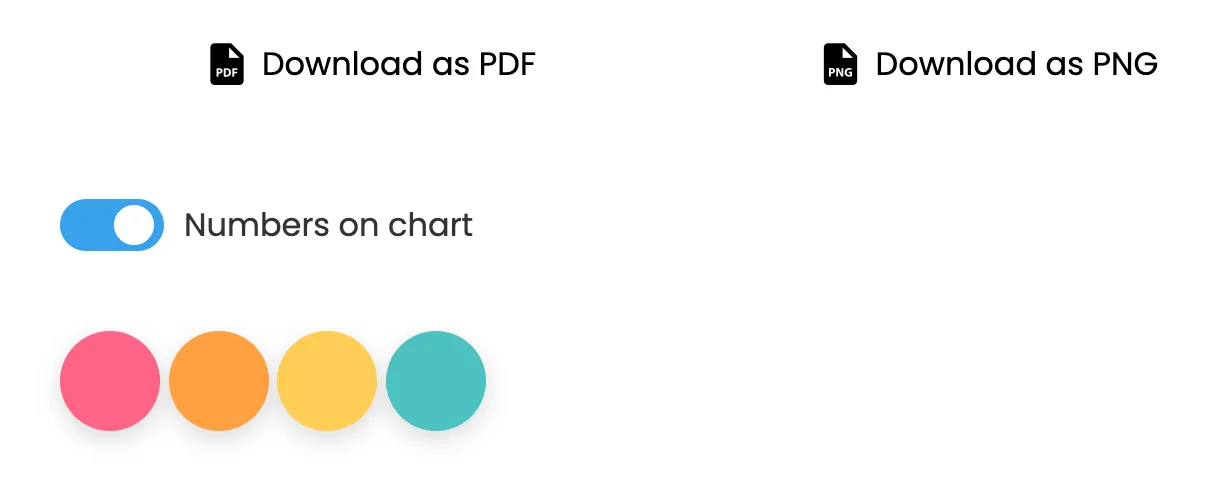
How to Change Colors in Nice Graphs
After generating a chart in Nice Graphs, small colored circles appear just below the chart, one for each data series. Click on any of them to open a color picker and change that series on the spot. The change is applied immediately without needing to regenerate the chart.
You can adjust colors as many times as you want until you find a combination that works. After customizing, use the export buttons to download the chart in whatever format you prefer.
Understanding Color Blindness and Design for Accessibility
Roughly 8% of men and 0.5% of women have some form of color vision deficiency. The most common is red-green color blindness, where reds and greens either look similar or indistinguishable. The second most common is blue-yellow color blindness. If you use red and green as your only differentiators, you've immediately made your chart unreadable for a significant portion of your audience.
The solution is not to avoid red and green entirely, but to pair them with other visual cues. Add patterns, textures, or direct labels. Use tools that simulate color blindness to preview your charts. What matters most is that no two series rely solely on color to be different—they should differ in brightness, position, or labeling as well.
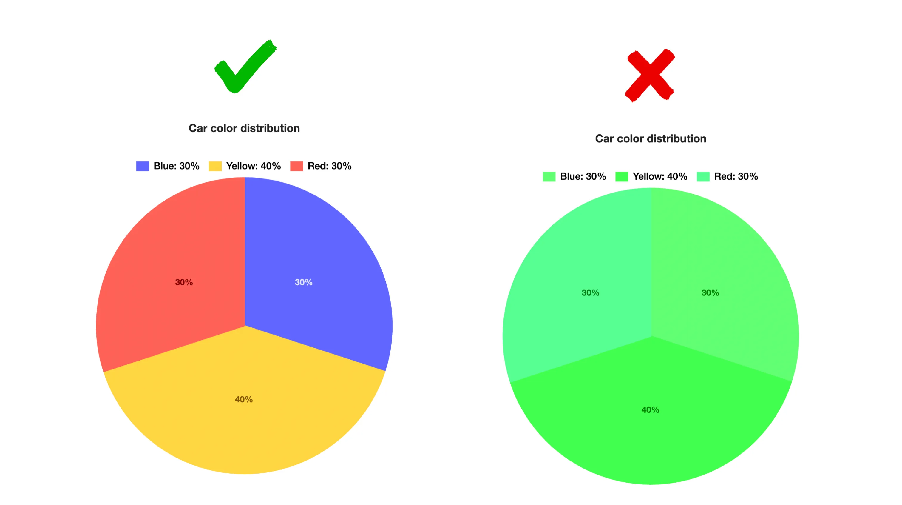
Real Example: What Goes Wrong and How to Fix It
Imagine a chart comparing three regions: North, South, and Central. If you color them navy blue, steel blue, and sky blue, most viewers will struggle. Even in a well-lit room, the eyes jump between the bars and the legend repeatedly, trying to confirm which is which. Change those colors to red, blue, and gold, and suddenly the chart is readable at a glance. The brain doesn't have to work to categorize the data.
This is not about making pretty colors. It's about reducing cognitive load. Every second a reader spends looking up the legend is a second they're not absorbing your message. Your job as a chart creator is to make the message instant.
Related Guides
Adjust your chart colors right now, open the tool, generate and customize in seconds.
Generate Chart