Data Labels on Charts: When Numbers Inside Bars Help and When They Get in the Way
Showing the exact value inside each bar or slice seems like the obvious thing to do, why make the reader estimate a number from the axis when you can just print it? But there are situations where those numbers cause more confusion than they solve. This guide shows both sides and helps you decide when to use them.
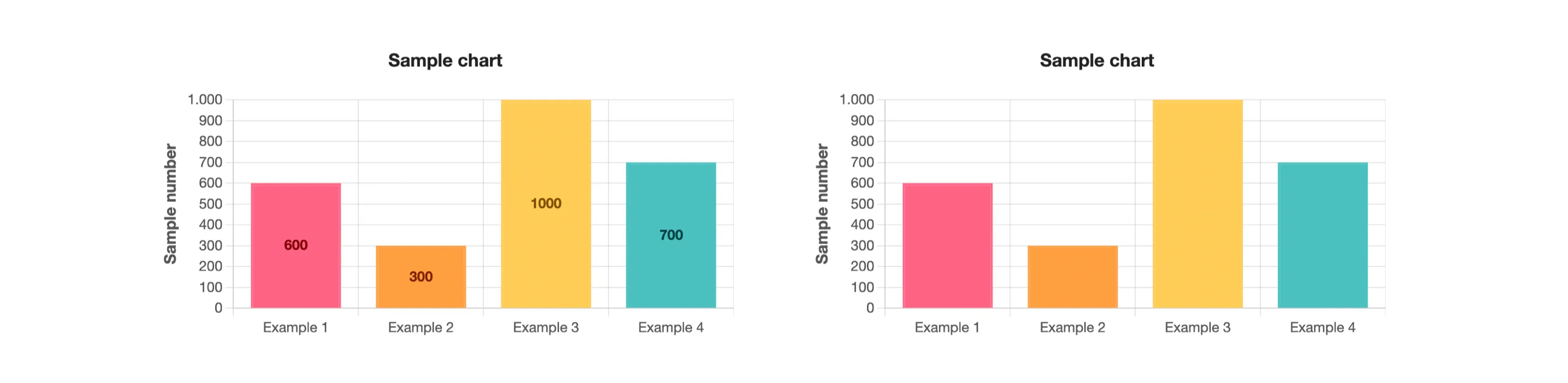
Chart With Numbers vs. Chart Without Numbers
A data label is the numeric value displayed directly on a bar, slice, or point, inside or just above it. When a chart has four or five categories, labels make the reading immediate: the reader sees the value without needing to trace a line back to the axis.
Without labels, the reader relies on the axis scale to estimate values. This works fine when precision is not the goal, for example, when the chart is meant to show a trend rather than exact figures. Both approaches are valid; what matters is choosing deliberately, not by default.
When to Use Data Labels, and When to Leave Them Out
Labels work well when the chart has a small number of distinct values and the exact figure matters to the reader. Reports, dashboards and presentations where someone will quote a specific number are good candidates. If someone will look at the chart and say “sales were 4,200 in March”, the label belongs there.
Labels become a problem when the goal is to communicate a shape, a growth trend, a seasonal dip, a comparison across many periods. In those cases, the numbers add visual weight without adding meaning. The reader's eye cannot process dozens of values at once, and the chart starts to look like a table that failed to become a table.
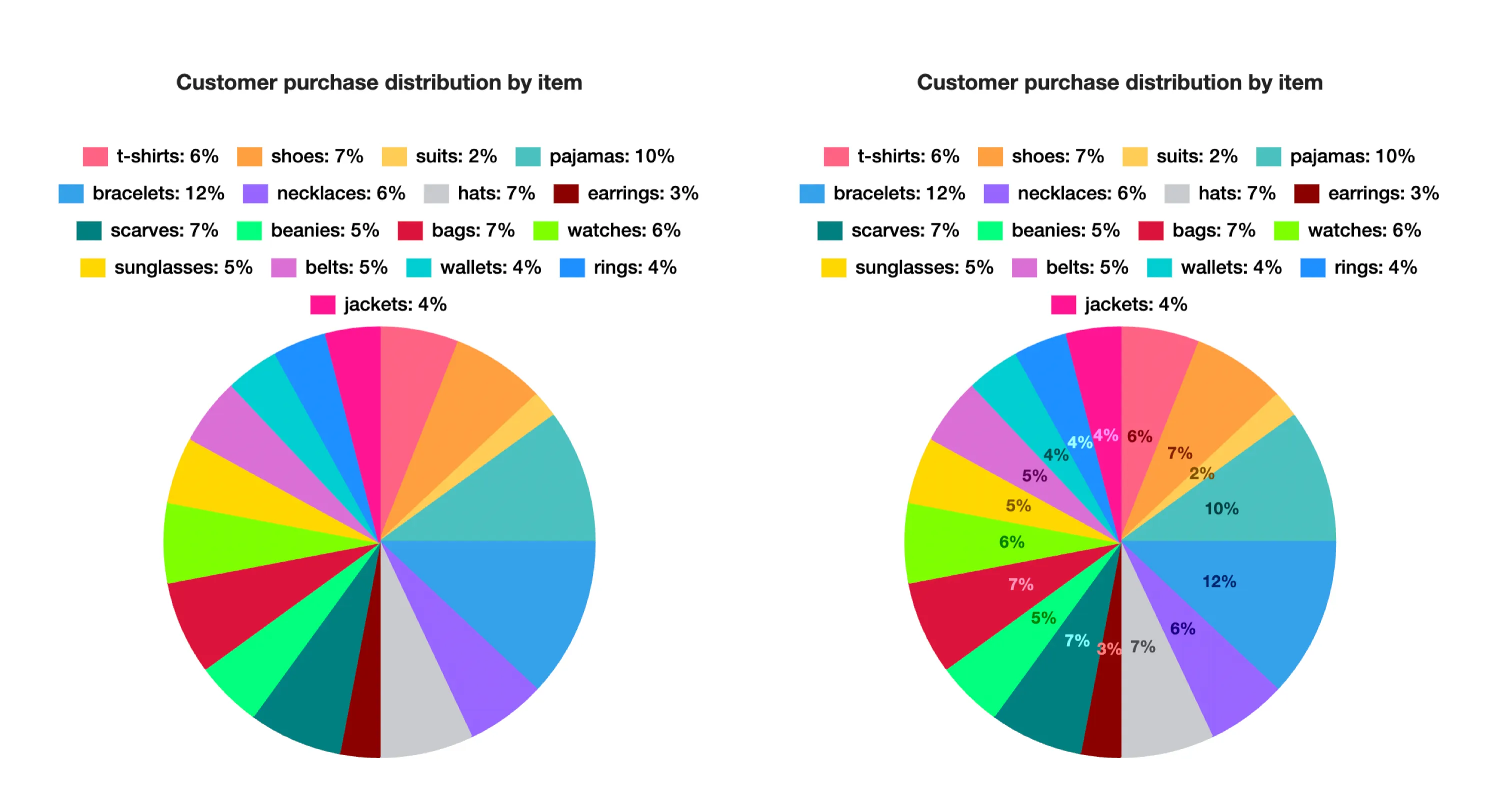
The Clutter Problem: Too Many Values at Once
When a chart has ten, fifteen or twenty bars, each with its own label, the numbers begin to overlap or shrink to fit. The result is a chart that requires significant effort to read and often forces the viewer to lean in and squint, exactly the opposite of what a chart is supposed to do.
When you have many categories, the better approach is to let the axis do its job and reserve labels only for the one or two values that are specifically important.
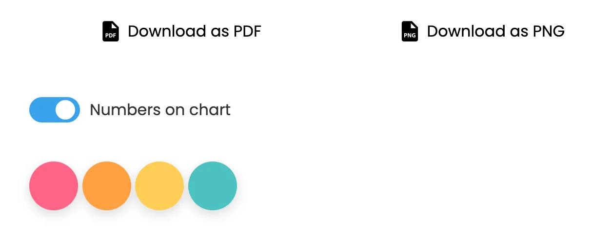
Turning Labels On and Off in Nice Graphs
In Nice Graphs, data labels are controlled by a toggle that appears in the chart options panel after a chart is generated. Flip it off to remove all labels instantly; flip it back on to restore them. There is no need to regenerate the chart, the change is applied on the spot.
This makes it easy to compare both versions before deciding. Generate the chart, look at it with labels, turn the toggle off, and see which version communicates more clearly for your specific data. Then export whichever one you prefer.
Data Label Positioning: Inside, Outside, or Offset
The position of a data label affects both readability and visual appeal. When a bar or slice is large enough, labels placed inside the shape are clear and compact. When space is tight, labels outside the shape prevent overlap but require more total space. Offset positioning uses leader lines to connect labels to their values, which works well for small slices in pie charts.
Experiment with different positioning options. Some charts look cleaner with labels inside; others benefit from outside placement. The right choice depends on your specific data distribution and chart type.

Formatting and Context: When Numbers Tell the Full Story
How you format the numbers matters. A label showing "1200" is less immediately clear than "1.2K". Currency symbols, percentage signs, and decimal places all communicate context. Before displaying a label, ask yourself: does the reader need to know this exact value, or just the relative position?
Data labels are most powerful when they reinforce the main message of the chart. If your chart is meant to show that Q3 sales doubled compared to Q2, displaying both values clearly makes that message instant. If your chart is meant to show growth trends over two years, cluttering it with monthly labels undermines that message.
Related Guides
Try it now, generate a chart and use the toggle to decide whether labels make it clearer.
Generate Chart